Class #1 Ellen Cooper: The Pallette

Ellen Cooper seemed nice, quiet, understated, but intense. I have found that people who are really good at what they do also tend to be really intense.
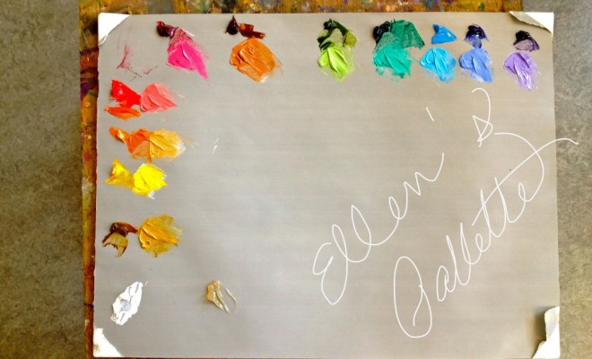
Ellen started with a lecture about, what else, color. She puts her colors out on her palette the same way everyday. Now, I don’t exactly do this. I don’t exactly have the same colors on my palette every time either. Ellen explains her rationale: putting out the colors the same way on her palette each day allows her to concentrate on just painting. She knows where each color is without even having to look. This would be really nice. Maybe I should try it.

Ellen’s palette:
Ellen puts down a cool color and a warm color of the same color. For example, she puts out Cad Yellow Medium with a Transparent Yellow Iron Oxide, or Cad Red Light and Alizarin Crimson. This is another interesting idea.
- Titanium White
- Transparent Yellow Iron Oxide
- Cad Yellow Medium
- Cad Red Light
- Alizarin Crimson
- Transparent Red Iron Oxide
- Sap Green
- Thalo Green
- Ultramarine Blue
- Mauve Blue Shade
- *Bring other colors in only when absolutely necessary.
Ellen likes everything to be as transparent as possible, particularly when the subject is more transparent, like rain on a sidewalk. I liked this concept. She told the class all Cads are opaques. I had no idea!
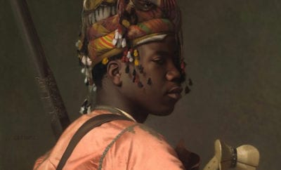
Another big fan of transparent colors was Vermeer. I am in love with Vermeer. He would have loved Ellen. You could almost see through his painting. He layered transparent color upon transparent color.
Ellen’s Rules: (She calls them “suggestions”)
- Try not to use Raw Umber. She says it muddies her paintings and dries flat and more mat.
- Use Transparent Yellow Iron Oxide instead of Yellow Ochre
- Avoid using store bought black. Ellen mixes her own.
- Be careful using White when mixed with a transparent it can make it too opaque, light and cool. White is only one way to lighten colors.
- Use Cad colors as another way to lighten darker colors on the palette. An example might be: Sap Green can be lightened with Cad Yellow Medium.
- Use caution when adding an opaque color to your painting. Opaque colors make whatever you are painting appear to come forward, even dark colors.
- Use only transparent colors for a Grisaille. Use turpentine substitute instead of oil to thin.
- Move into the painting after the Grisaille by mixing up color notes for each area in the light and in the shadow. A color note is an approximation of the color and value you are seeking to state in that area of the painting.
- Add a medium as one way to make crisper edges.
At the end of class, Ellen pointed to an upholstered chair and showed the class the broad spectrum of different cool and warm colors, depending on the light and the shadow.
Ellen has thought a lot about the painting process and how things work. She has blended old techniques with new ones. All her ideas and rules add up to what I like to call the “Cooper Technique.”
I liked this class a lot.
Get great posts like these in your inbox!
Enter your email and we'll send you new posts when they are published. It's that simple!
We promise to never sell or distribute your email addresses. Your privacy is safe with us.
Pingback: Aaron Westerberg Class #3: Slow and Steady | The Traveling Artist